Horse Race Data Visualizations
Posted by Dave at 6/14/2015 7:44:06 PM
Many years ago, mostly for fun, when I was studying technical communication and data visualization, I created charts for horse races. The "charts" published by the Daily Racing Form and others are just numbers for each fraction of the race, their running position, and lengths beaten. What would it look like graphically? I played around with it and came up with charts for the 2002-2005 Kentucky Derbies.
Note that colors for each line conform to the standard racetrack saddlecloth colors.
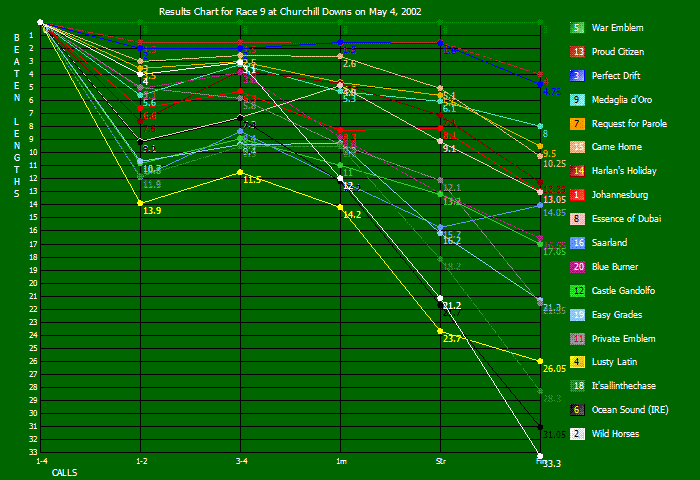
2002 War Emblem
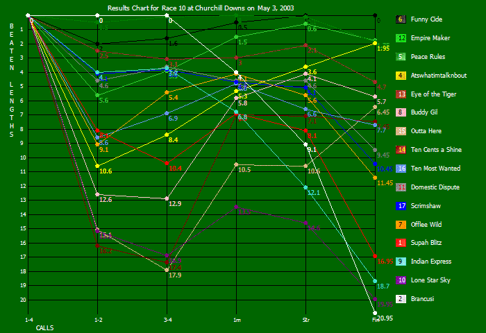
2003 Funny Cide
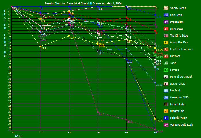
2004 Smarty Jones
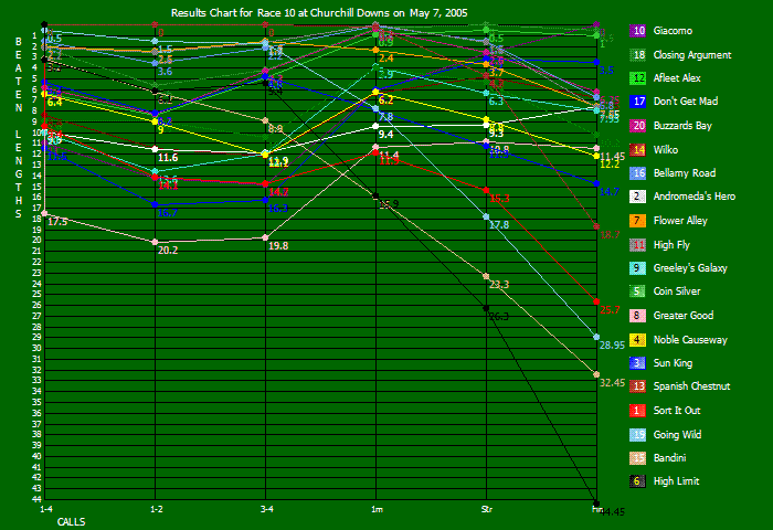
2005 Giacomo
Note that colors for each line conform to the standard racetrack saddlecloth colors.

2002 War Emblem

2003 Funny Cide

2004 Smarty Jones

2005 Giacomo
6,068 views.

